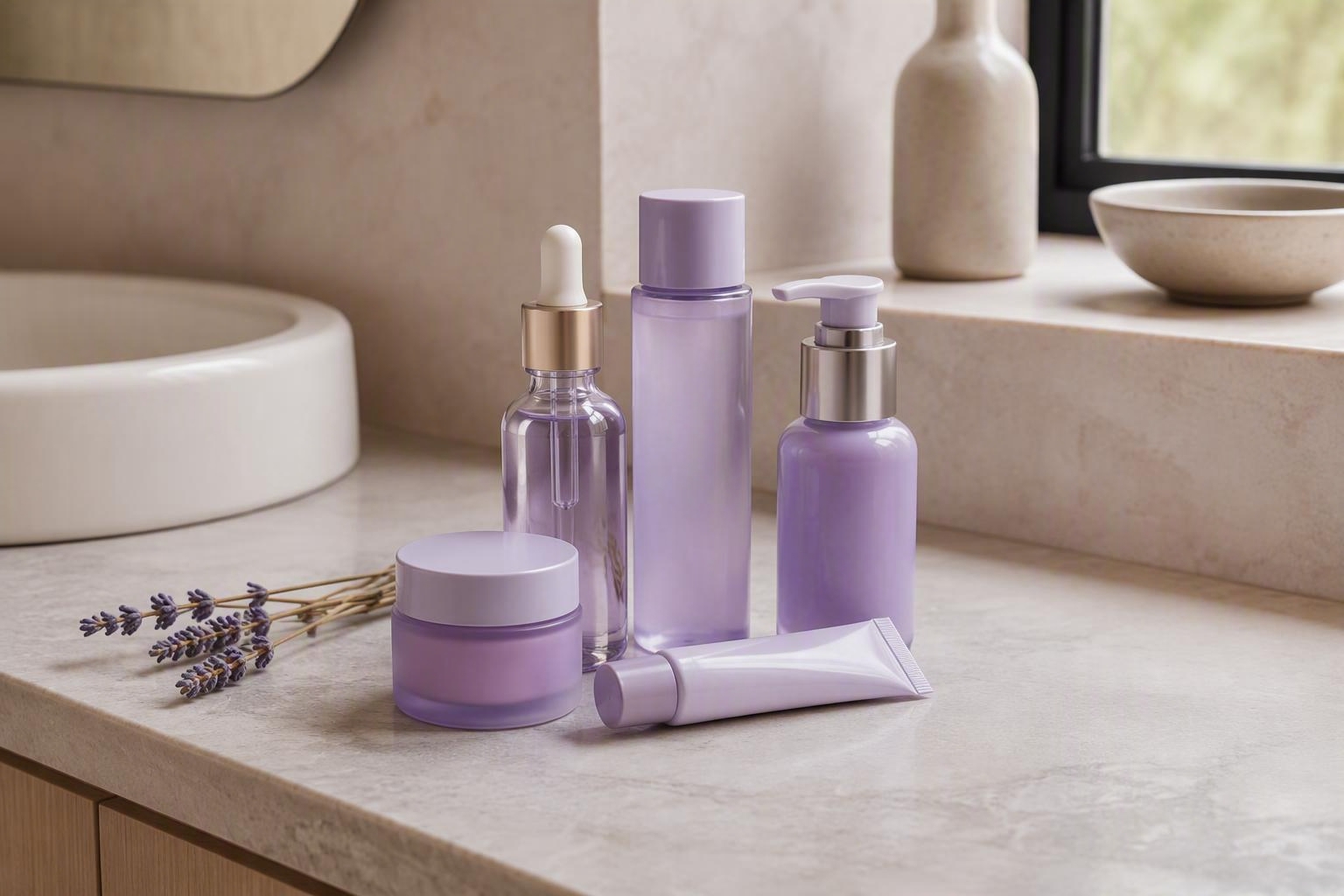
You reach for a new serum at Sephora and notice the bottle is soft lilac. The moisturizer next to it? Pale lavender. The eye cream two shelves down? Same family. Six major launches in the past few months have landed in shades of violet, and your bathroom shelf is starting to look like a spring garden.
The question is whether the color signals anything about what's inside, or if it's just aesthetics doing their job.
The wave of violet packaging
Lavender and lilac tones have taken over prestige skincare displays. You'll see them on new launches from brands at Ulta, Sephora, and even drugstore end-caps. The timing is tight: multiple products arrived within weeks of each other, all leaning into the same soft purple palette.
This kind of coordination doesn't happen by accident. Color trends in beauty often move in waves, driven by mood boards, trade shows, and supplier catalogs that everyone pulls from at the same time. Lilac hits a sweet spot right now. It reads as calming without being clinical, modern without being cold, and just different enough from the millennial pink that dominated a few years ago.
The packaging telegraphs a promise before you even flip the bottle over to read the ingredients.
What lavender actually does in skincare
Lavender extract and lavender essential oil do show up in formulas, though not as often as the packaging might suggest. Lavender oil has some anti-inflammatory properties and a familiar scent that many people find relaxing. It also contains linalool and linalyl acetate, compounds studied for their potential to reduce skin irritation.
But lavender oil is also a known sensitizer for some people. It can trigger contact dermatitis, especially in higher concentrations or when applied to already irritated skin. That makes it a complicated ingredient: genuinely soothing for some, actively irritating for others.
Most lilac-packaged products don't actually contain lavender. They contain niacinamide, centella asiatica, peptides, or hyaluronic acid. The calming claim comes from those workhorses, not from anything purple-hued in the formula. The color is doing the work of signaling calm, while the ingredient list does something else entirely.
Why brands choose purple right now
Color psychology in marketing is real, even if the effects are subtler than brands hope. Purple sits between the cool rationality of blue and the warmth of pink. It has associations with rest, introspection, and gentle care, all of which align with the current language around skincare routines.
The beauty industry is also reacting to a few years of aggressive, results-driven messaging. Retinol, acids, actives: the conversation was all about visible change and fast timelines. Lilac packaging is a visual pivot. It says this product will not strip your skin or make you peel. It will be kind.
That shift also reflects what's happening in the broader culture. People are tired. Skincare that looks like it might let you rest, even if it's just a thirty-second step in your routine, has appeal. The color is a shortcut to that feeling, whether or not the formula delivers on it.
What to check before you buy into the aesthetic
If you're drawn to a lilac bottle, flip it over and read the back.
Look for the active ingredients that actually address your skin concern. If you want calming, check for centella, allantoin, or colloidal oatmeal. If you want barrier support, look for ceramides or fatty acids. If you want hydration, look for glycerin or sodium hyaluronate.
Check the ingredient order. Lavender extract listed near the end of a thirty-ingredient formula is there for marketing, not for function. If the first five ingredients are water, glycerin, and three emulsifiers, you're looking at a basic moisturizer in pretty packaging, which is fine if that's what you need.
Watch for fragrance. Lavender oil often appears as part of a fragrance blend, which means it's there for scent, not efficacy. If you have sensitive skin or rosacea, that can be a problem even when the packaging promises calm.
Consider whether the product solves a real gap in your routine or just looks good next to your other bottles. Track what you're actually using with Roona so you can see whether a new purchase gets opened or just sits there looking serene.
When the vibe matches the formula
Some lilac-packaged products do contain formulas that back up the aesthetic. You'll find gentle cleansers with oat extract, barrier creams with minimal ingredient lists, and sleeping masks designed for sensitive skin. The color isn't lying in those cases. It's just doing its job as shorthand.
The trouble is that you can't tell from the outside. A purple bottle can hold a genuinely soothing formula or a generic moisturizer with a trendy scent. The only way to know is to read the label, check reviews from people with your skin type, and give it a few weeks of consistent use.
If you're someone who responds to color and finds that a calming package makes your routine feel more intentional, that's not nothing. Skincare is partly ritual, and if a lilac bottle helps you slow down and apply your products more carefully, the color is doing work even if the ingredient list is ordinary.
What happens when the trend moves on
In a year, the next color will arrive. Olive green had a moment. Terracotta showed up everywhere last year. Lilac will fade, and something else will signal calm or energy or renewal.
The products themselves may not change much. Brands will keep selling niacinamide serums and ceramide creams, just in different bottles. If you find a formula that works, the packaging matters less over time. You'll repurchase it in whatever color it comes in, or you'll move on when something better lands.
The real value is in knowing what you're looking at when a trend like this rolls through. Purple packaging is not a guarantee of gentleness, and it's not a red flag either. It's a design choice shaped by the same market forces that determine which ingredients get hyped, which textures feel modern, and which price points get shelf space at Sephora.
Keep your focus on what's inside
The next time you spot a lilac serum or a lavender cream, take a second to separate the aesthetic from the formula. Ask whether the ingredient list matches the promise the color is making. Check if the product addresses your actual skin concern or just looks like it might.
Skincare works best when it's consistent, appropriate for your skin, and genuinely useful in your routine. If a beautiful bottle makes that easier, great. If it just adds clutter, skip it. A tool like Roona helps you track which products actually make a difference, so you can build a routine based on results instead of vibes.
The packaging will keep shifting with the trends. Your skin will keep asking for the same things: hydration, protection, gentle care, and maybe one or two actives that address whatever you're focusing on this year. The gap between those two things is where the work is.
Trend source: Cosmetics Business (US)
Keep reading
-

Barrier-First Routines for Tropical Climates: Hot, Humid Care
Barrier repair works differently in heat and humidity. Here's how to protect your skin when sweat, sun, and moisture are part of every day. 26 July 2026 -
Sephora's Tween Skincare Lawsuit: What Parents Need to Know
A clear guide for Singapore parents on the Sephora youth skincare lawsuit, ingredient labels, age-appropriate routines, and safer shopping decisions. 8 October 2026 -
Sephora Afterpay Sale Singapore: What to Buy and Skip
Make smarter Sephora Afterpay Sale purchases in Singapore with a practical guide to useful skincare, makeup and haircare deals worth skipping. 27 August 2026